Blog
Collections Activity Summary - Open Exhibits Design Summit 2011
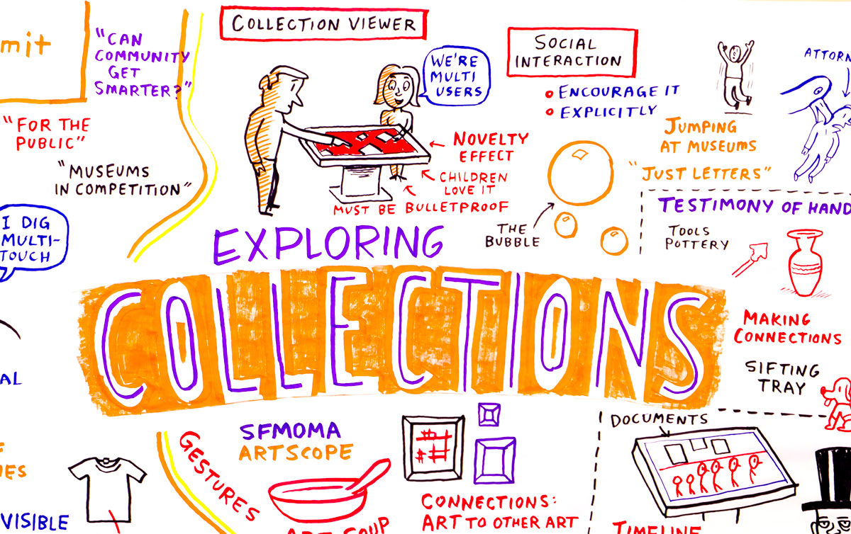
In this session, summit participants were asked to develop original user experiences that would enable museum attendees to interact with a variety of art, natural history and science collections.
Themes were selected by project advisers, and were practical examples of real exhibits from their own museums. Over the course of an hour, summit attendees engaged in an experiential process that resulted in a series of drawings, diagrams, and other tools to illustrate their ideas to the group.
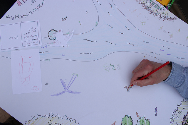 This activity centered around the following exhibits: SFMOMA Art Scope, The Testimony of Hands, Lincoln at 200, Riverbluff Cave, Evolving Grasslands, and Hunters of the Sky.
Once complete, summit attendees came together to share their ideas on how to optimize the user experience of these exhibits. Most of the group presentations focused on experiences that enable people to understand connections between objects in the various collections. A variety of creative ways for users to interact with multitouch/multiuser tables were presented.
For a complete description of the activity, please see this PDF:
For example, in SFMOMA’s Art Scope exhibit dubbed “Art Soup” by presenter John Llewelyn, users would draw on the touch screen with intuitive gestures and based on the shape of the gesture, paintings would “bubble up” from the collection that shared that shape. Participants would “pour” their painting into a bowl in the middle of the screen and then a narrative would emerge that would connect all the paintings.
Despite the differences between the six exhibits, presenters unanimously focused their design around experiential teaching, and creation of practical examples of ways users can connect pieces of the collections as well as create context for individual pieces of the collections.
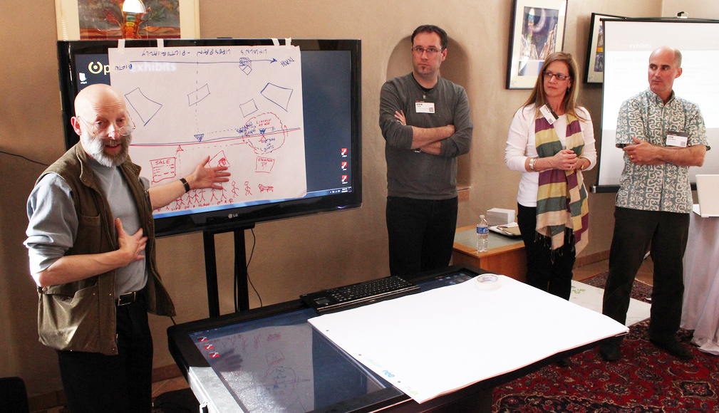
As shared in “The Testimony of Hands”, Jeff Heywood emphasized that documents, artifacts, and art tell stories. This information comes to life when connections are made. Direct user interaction can allow an individual to take a deeper dive into the available collection all in one place, and in many cases as part of a team of users at the table.
Integrating techniques from modern game design, multitouch table elements can also be utilized to create deeper connections among multiple users and help stimulate connections between people.
Natural user interfaces and communities that work
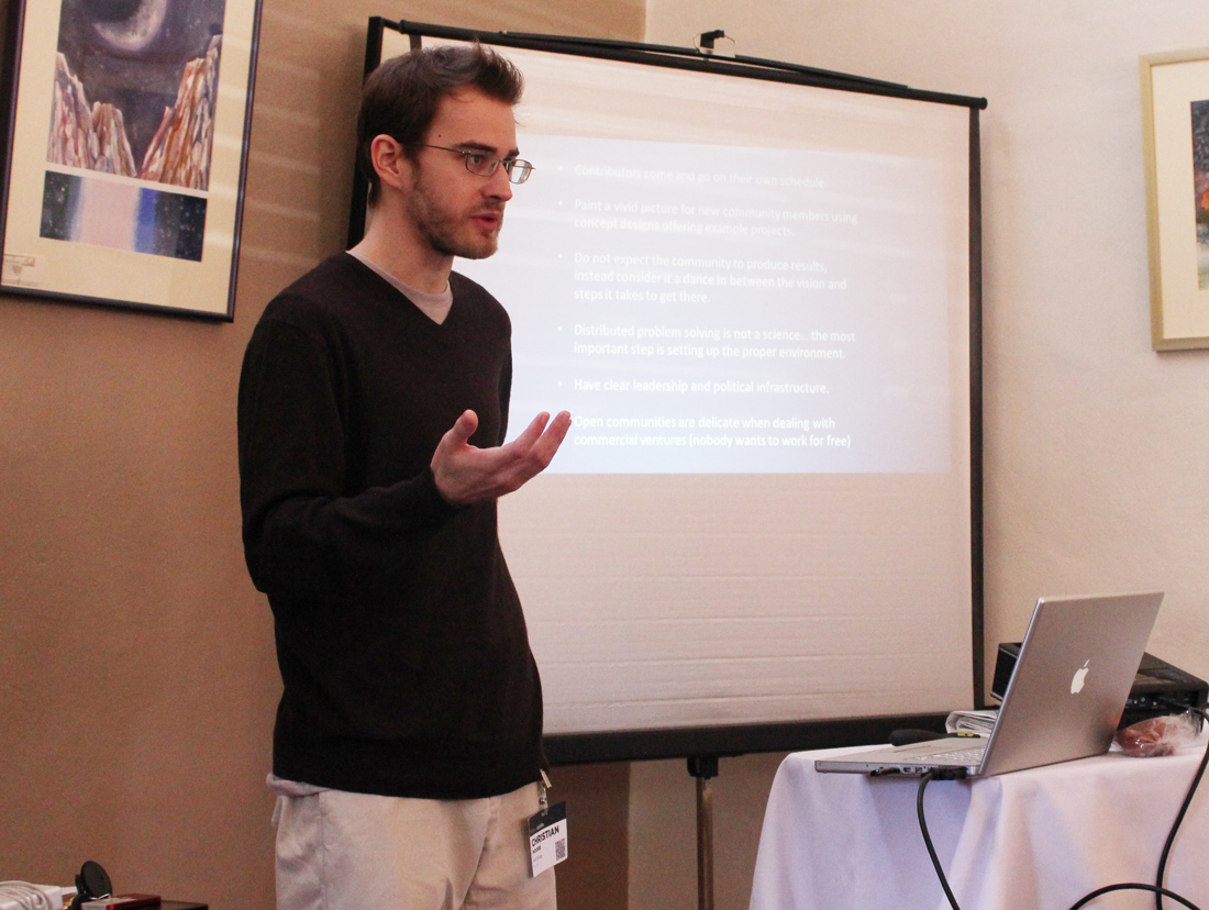
Six years ago, Christian Moore was playing with Natural User Interfaces (NUI is an Open Source platform) as a hobby. "The NUI is organic, it's active by instinct in the same way people learn to wave to other people," said Mr. Moore, adding, "You're using human nature in your exhibits."
In 2006, Mr. Moore founded an open community, NUI Group, around NUI, which today numbers around 12 million participants. He recently spoke at the Open Exhibits Summit in Corrales, New Mexico concerning building online communities of Open Source developers.

Mr. Moore outlined key points for establishing effective and active communities:
- Clear leadership
- Strong mission statement
- Open Communication
- Leverage educators going to a site
- Simple things work better
- Be able to change expectations over time
- Make NUI accessible to newcomers and experts alike
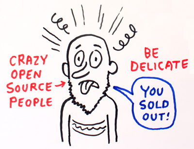 "I got into [NUI] as a hobby and it became my life," said Mr. Moore. He highlighted the care needed in monitoring and managing an Open Source community to get the most positive results. "Get rid of the negative people; bring to light the positive people." Mr. Moore continued, talking about the purist nature and philosophy of a large portion of Open Source programmers. "Open communities are delicate…you have to gain the trust of the developers," he said.
Many times, especially when working with a budget, it's challenging to attract developers, causing development solutions to stagnate, but Moore offers a simple maxim:
Answer the question posed by potential participants, Why should I do this?
"If you can get the traffic, you can get solutions," he said regarding attracting a core of members and users. "Community is more powerful than money."
Slides from Christian Moore's presentation can be viewed here:
Building a Community (Site)
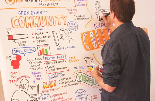
Thursday morning's session on building web communities featured three speakers who contributed research findings, identified existing resources, and pinpointed areas for improvement when considering how to build an online community.
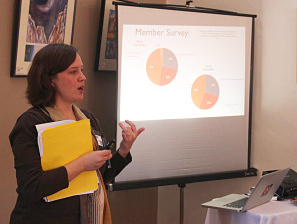 Jennifer Borland (Rockman et al) started the discussion with a report on current Open Exhibits web traffic, and a snapshot of the online community as a whole. Borland's research tells us that 120 days into the project, the data is suggesting that visitors are focused on exploration of the environment and not yet modeling a community. Educators appear to be looking for ways to extend this technology into classrooms, either directly, as a teaching tool, or as a technology to review with advanced design students.
Analysis of Open Exhibits site traffic places most members into 4 categories: Education-oriented institutions, visitor-oriented institutions, design and tech firms, and other (general interest). A recent member survey analyzed members’ level of participation, technical backgrounds, geographic location, and reasons for using the site.
Results of Borland’s analysis are available in this pdf of her presentation:
Kathleen McLean (ExhibitFiles) drew on insights from her work on the ExhibitFiles project. ExhibitFiles is a community resource aimed at saving museums from the repeated task of reinventing the wheel, much like Open Exhibits wants to do with digital exhibits.
Both projects share the big idea, as McLean says, "How can we create a community where people can talk and add their own things?" When you have done that... it is about improving the wheel.
Jim Spadaccini indicated that the key to ExhibitFiles was "ripping things out and making it as simple as possible." They now have a community of almost 2,000 members sharing case studies, reviews, and creating conversations around museum exhibits.
In closing, McLean emphasized her belief that the keys to the success of a community site and its resources are simplicity and ease of accessibility. The audience needs to feel comfortable with a visit, and that their time spent online was worthwhile. Remember, museum staff doesn’t typically live online. They live on the museum floor, talking to the public.
Christian Moore (NUI Group) has created a global research community focused on the open discovery of natural user interface (NUI). Since its inception, the NUI Group has grown to 12,000 members and 70,000 discussions. Starting with a brief description of NUI as a natural gesture, “almost organic” Christian sealed his introduction with a quote from Allessandro Valli that sums up the passion of this quest:
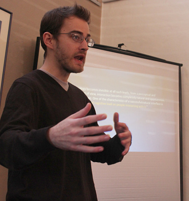 "As technology becomes invisible at all such levels, from a perceptual and cognitive point of view, interaction becomes completely natural and spontaneous."
Moore reported his insights from the point of view of growing an Open Source community. His observation is that “if your end product is food, you can't just focus on the food, despite demands from customers… At the end of the day, people want to eat the food," but Moore cautions, "but you need those farmers."
Moore expressed that he feels the Open Exhibits site is on the right track, but would benefit from a few changes. He expressed the importance of having a strong, visible leader, working to gain the trust of users and developers, simplifying the site for usabilty, and using it to encourage participation.
Focusing on the open source community, Moore argues that Open Exhibits may need to refine its mission statement and open channels of communication on additional levels. "Keep the drama low and the output high," Moore says. Ignore the trolls, focus on productivity.
Slides from Christian Moore's presentation can be viewed here:

Designing a multitouch exhibit for 2-6 year-olds with Ian Holtum
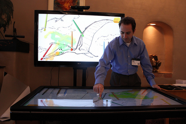
Ian Holtum is a Multimedia and Technology Developer for the Denver Museum of Nature & Science. Mr. Holtum noted that his background is in development and marketing - for kids. He spoke at the 2011 Open Exhibits Summit about designing a multitouch exhibit for 2- to 6-year-olds.
"We wanted to allow the kids to use the same skills for actual painting on the digital table," said Mr. Holtum. So he and his team spent one week building a prototype table. The museum was already using multitouch tables and wanted to see how the technology would work in their new spaces. As with any new technology, there were challenges to overcome.
After thirty days of observing the prototype table in use, the designers noticed that parents showed the kids the basics of the table, the kids then learned advanced interactions on their own, and then they were better at using the table than their parents. The play was parallel and cooperative: girls enjoyed the social structure of the experience while the boys preferred the prescriptive nature of painting within the lines, telling others how to "paint" properly.
Mr. Holtum said he enjoyed what he called the "Oh, wow!" moments. "They [learn to interact] and it works," said Mr. Holtum. "Then they would run off and tell their parents what they learned," he added.
To see how effective the multitouch table was in recreating the actual experience of painting, an actual painting table was positioned directly next to the prototype digital table. "Kids love digital," said Mr. Holtum, "They would start with the actual paint, then moved to the digital table," he added. Somewhat surprisingly, the digital table was a more social experience than the actual paint table. "The digital table is novel, and there was the learning aspect to talk about," said Mr. Holtum. He added that the actual painting was fun and easy for the kids, but it was the new experience of the digital table that really got them talking and interacting with each other.

By acknowledging and then addressing the challenges, Mr. Holtum and his colleagues learned some interesting things. He outlined the technological challenges of developing an exhibit for kids:
- Creating it as a multi-user table to allow a social experience
- Using digital brushes as an object to interact with the table
- Defining who controls elements of the table and when they control them
- Discerning deliberate actions from natural actions (an elbow or sleeve from a finger)
- Avoiding magical thinking, demystifying the technology used
These challenges went another level deeper regarding development:
- Flash gets slower and slower as the table is used, causing system crashes
- User position/table gestures, the table was too high for kids, resulting in unintentional gestures
- Capabilities of capacitive screens (can't decipher touches of skin from clothing)
- Interface (people didn't understand the options for brushes and paint colors)
- How to do persistent data - how to track objects, connecting them with visitors.
Mr. Holtum said most of the challenges were overcome. The Flash issue was solved using creative screen refresh techniques and the interface has been trimmed down to its most basic elements.
The final challenge of persistent data is the issue to solve, said Mr. Holtum. There's no way to associate what's happening on the multitouch table with a specific user. Mr. Holtum used the example of paint brushes. If a user puts one paint brush down to use another, the user has no continued connection to the brush. The table isn't fully engaged with what the user is doing. Solving that is what Mr. Holtum sees as the ultimate goal for the best user experience. "That's what's really exciting about this stuff."
Slides from Ian Holtum's presentation can be viewed here:
Research and evaluation for the Open Exhibits grant project
 During the last session on Thursday, Kate Haley Goldman explored the process of research and evaluation for the Open Exhibits grant project.
Goldman shared three phases of the research process:
- Research literature on best practices – (Currently there’s almost no existing data on the best practices for multimedia in museums)
- Formative evaluation (Creating a set of defined attributes, goals, and theorizing what experiences should feel like)
- Evaluating multimedia interactive environments
When speaking to the National Science Foundation, NSF, Goldman shared her belief that all questions came back to one issue: How do these multimedia exhibits address social interaction? She says, “As NSF pushed us further to look at social interaction, we reminded ourselves that we had to be careful not to design a research study that wasn’t designed to look at this in the first place.” She emphasized that, while social interaction is valuable, the goals of this project are more related to identifying the best way to present the content and exhibits.

 At this point, Kathleen McLean chimed in and shared her observations of visitors' experiences of multimedia exhibits. “They expect that when they go up to that table, it will offer more for them than they would get at a kiosk”. McLean adds, “Tables are social places that bring people together. When you come to a table, it’s an inherently social event.” She continues, “They expect to be able to go up and do something TOGETHER, not four people leading their own thing.” When people gather around a table, one can expect to play card games, eat dinner, make something, and engage in other group activities.
Goldman says that the issues discussed at the summit today focused on formative concepts such as: How can we make the user experience more natural? How can we make it more affordable? We also need to be asking how we can improve the learning experiences of exhibits. Saul Rockman expanded on this with reference to one of NSF’s stated goals asking, “Whatever the activity is supposed to do, does it encourage people to follow and pursue careers in science? Does it make them feel part of the experience?”

