Blog
Participation in Open Exhibits - The First Thirty Days
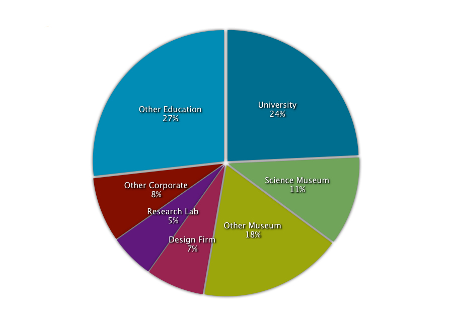
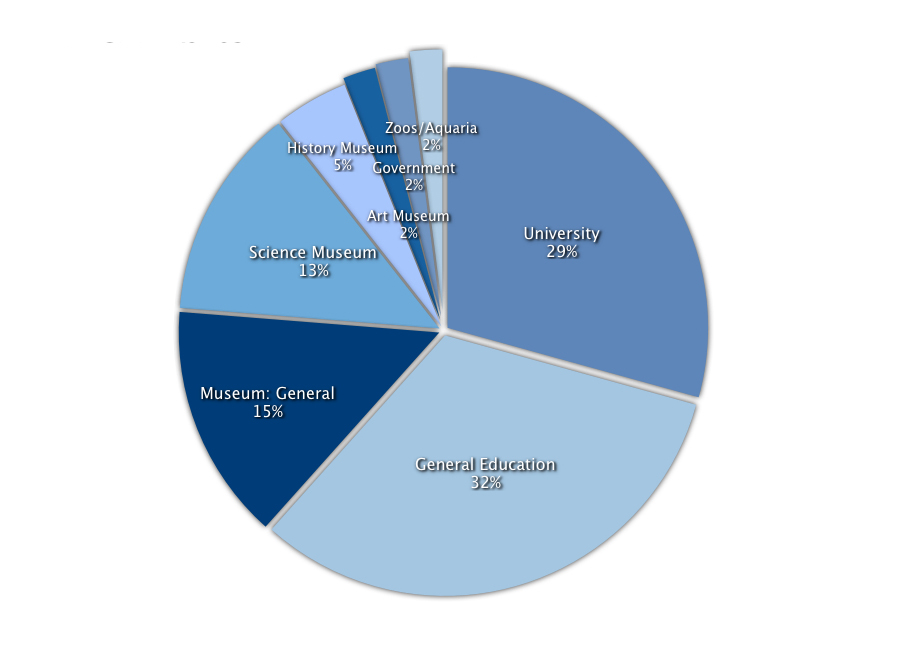
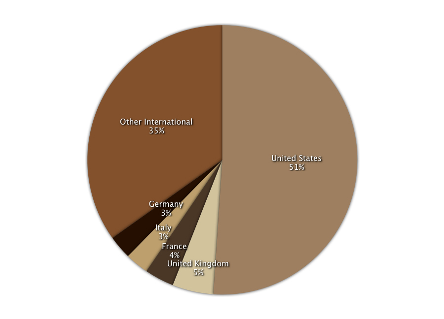
We recently exported the information from our member database to get a better idea of who's using Open Exhibits, thirty days in. (Click on the graphs to see them full size.) So far, we've discovered that:
- 51% of our users have an educational or university affiliation; 29% are affiliated with museums, zoos & science centers; and the remaining 20% are involved in business or for-profit research.
- Of our educational and museum users, 29% are from universities, 15% are from the general museum field, 13% are from science museums, 5% are from history museums, 2% are from art museums and 2% are from zoos and aquaria.
- 51% of users are from the US, with the other 49% coming from 42 other countries around the world.
- 70% of users have requested Core, which is great! If you haven't, you can do so from your profile page or learn more about it on the software page.
We'll be coming out with updates to these statistics and more in-depth information as the project goes on. If you're an Open Exhibits user, keep a look out for an email with a few brief questions about your experience with the site and software. We'd really appreciate you taking the time to fill it out so that we can better understand what you hope to do with Open Exhibits and how we can help you do it.
Using Agile Development Tools to Inform Exhibit Design
 We’ve been reading Nina Simon’s post on A/B testing in museums (where two different setups of the same exhibit or exhibit element are put on the floor and compared). She talks primarily about conceptual or physical design elements (note cards, question structure) but we started thinking about this kind of testing and computer-based exhibits.
One problem museums can face when trying to implement A/B testing or another type of exhibit testing is that development of distinct exhibits can be very expensive and time-consuming, and spending a large chunk of money for what is essentially a prototype can be a deterrent. We generally try to make our exhibits easily modifiable via an external file, so that the application can be easily changed without an expensive secondary development process. And we’re carrying this one step further with Open Exhibits by offering the software and knowledge base for free, to make iterative exhibit development easy and cost-effective and to allow exhibit designers to learn from one another in the same way that programmers do.
In software design, this is a technique that is part of “agile development.” Program structure grows out of trial-and-error. And actual use. By actual people. A big mistake in almost any of kind of design is assuming that because a program (or exhibit) has the functionality and content that the designers wanted to put in there, and there are no obvious gaps or bugs, then it works. Which is very, very wrong. If the software or the exhibit doesn’t encourage the user to interact in straightforward, functional ways, most won’t sit there and muddle through it. They won’t spend five minutes pressing buttons on the interface to figure out how to read information about one dinosaur. They won’t write a detailed response to a question with a tiny annoying golf pencil that is hard to hold. They will leave.
And if you design interfaces that are easy to change and modify without throwing the whole thing out, it’s much easier to learn from the weak points in a design and alter them to make the final product stronger. Flexibility is an essential component of effective design and development. It allows exhibit developers and software designers to easily change and test elements with little to no added cost, giving museums the ability to experiment and test interfaces, rather than having to take a potentially expensive chance on custom-built software or defaulting to the tried-and-true.
As Open Exhibits progresses, we hope that it can serve as a sort of virtual A/B testing, with multiple users letting us know what did or did not work for them with existing applications AND being able to build and test modifications to those applications, or build an application from scratch, to create effective and enjoyable exhibits.
If you have any tips on interaction design, feel free to write a blog post for Open Exhibits (just click the share tab!). We’d love to hear your thoughts.
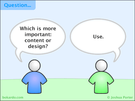
Comic by Joshua Porter
Open Exhibits Gesture Library & Illustrations Now Up!
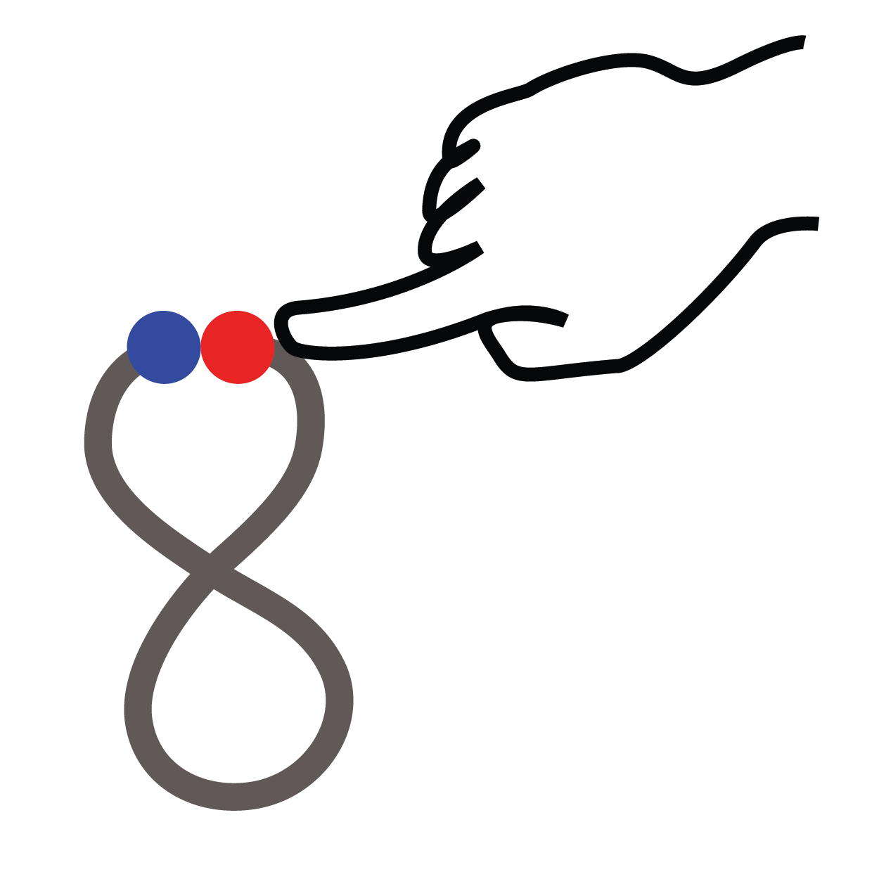 Our new gesture library page provides the codebase for our open source gesture library and documents the hundreds of gestures you can use with Open Exhibits, including a new set of stroke gestures to allow you to draw and recognize letters and symbols within your multitouch applications.
You can download the individual gesture glyphs, a bitmap version of the poster, or the full vector PDF, which allows you to manipulate the images in Illustrator as well as resize the image for sharing and printing. The images are released under a Creative Commons license; we just ask that you attribute Open Exhibits and share anything you create using the gestures under the same license.
What Exhibits Do Museums Want? Our Partners Weigh In.
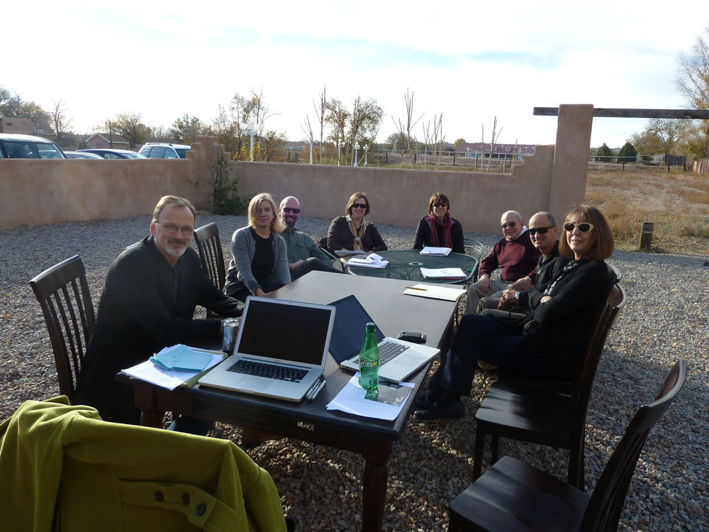
We recently had our first meetings with the Open Exhibits partner museums, with whom we will be building six exhibits over the next 3 years. The exhibits will be available as downloads on the Open Exhibits site. Both the source code and content will be freely available. At this first meeting, we got some great insights into what exhibit tools will be most valuable.
All of the museums we're working with are based in the Southwest. The New Mexico Museum of Natural History, New Mexico's largest natural history museum, and the Maxwell Museum, a small anthropology-focused museum, are located in nearby Albuquerque. The Don Harrington Discovery Center is a hands-on science center located 4 hours away in Amarillo, Texas.
The size and focus of the three museums are different, but based on the interest we saw, the first exhibit at each museum will likely be a version of a Collection Viewer. Both the Natural History Museum and the Maxwell have extensive permanent collections, so the Collection Viewer will allow them to display artifacts and fossils that wouldn't otherwise be seen by visitors. While Don Harrington doesn't have a permanent collection, they were interested in being able to present more information about the birds of prey in their Hunters of the Sky exhibit. Presenting their collections in a dynamic and easily navigable way is often a big challenge for museums, and we look forward to working with our partners to find creative (and shareable!) ways to present collections to the public.
As far as other exhibit types go, all three could also agree that a dynamic mapping application would serve each of their museums well. Originally, we had planned on building an RSS reader to provide updates and current events, but the consensus was that mapping is useful both as a way to present a visual guide to current events (our oil spill application is a good example) and to present historical information. Our partners envisioned mapping fossils, archaeological sites, and bird ranges, among others.
The partners were also interested in timeline exhibits, a template that's likely to be released later in the project. We also spoke about combining Open Exhibits core with Google Sky to provide a comprehensive, simple multitouch-able astronomy exhibit, or potentially integrating external sensors with an Open Exhibits application.
While we don't have plans to build any of the latter options yet, many interesting possibilities were put on the table, and we're excited to see the results. We'll be discussing more concrete design parameters for these exhibits at our mini-summit in the spring. And any of these projects could change if someone (hint, hint) uploads an awesome third-party module or exhibit that seems to be a good fit. We'll post updates as the projects roll along.
Links We Liked: iPad Screen, Diaspora, Collection Space and More!
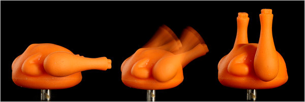
We got really really excited about the new Collection Space software, we checked out these suggestions on social media marketing for museums, we admired this screen made of 25 iPads then we turned our iPad into a fiddle with a little help from the app store, we gazed longingly at some amazing images tweeted by astronauts on the space station, we're curious about this new open-source alternative to facebook, and we're kind of dying to have this funny turkey timer. Happy Thanksgiving everyone!
