Blog
Multitouch Gesture Library & Illustrations

When the Open Exhibits core software is released, it will come with an extensive gesture library and gesture illustrations available for reuse under Creative Commons. Currently, GestureWorks, the framework on which Open Exhibits is built, supports 20 unique gestures. The Open Exhibits core (and GestureWorks 2.0) will support over 200.
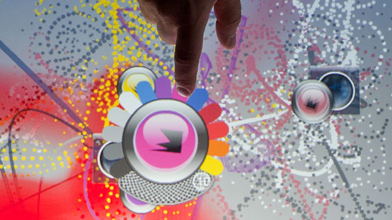
These gestures will enable new types of multitouch design and interaction that go beyond the basics of pinch zoom and drag and even the 3D tilt interactions that are currently available with GestureWorks. Different stroke types, including shapes, numbers, letters and tables, will be recognized, allowing users to write or draw and have an application respond. Rhythmic gestures (multiple interactions at specific intervals) and pressure-dependent gestures like rock will also be included.
You can find our current open source gesture library and illustrations on the GestureWorks site. We will be announcing a firm release date for Open Exhibits core and GestureWorks 2.0 in the next week.
Designing for Multitouch Tables and Surfaces
We've spent a good chunk of the past two years developing multitouch tables and tabletop exhibits. While multitouch tables are often the first choice for museums and collaborative spaces, designing exhibits for collaborative tabletop spaces presents a unique set of design challenges. Many first-time tabletop designers (including us!) make the same mistakes when designing such interfaces, as the majority of interactive and web-based exhibits up to this point have been single-user, handheld or kiosk devices.

A few things we've learned:
1)Don't forget that the table is omni-directional.
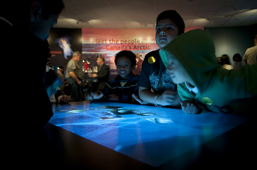
On handheld devices, you can count on the user viewing the screen from a certain perspective, so you can anchor your navigation bar and other elements accordingly. On tables, visitors can approach from any side, so it's important that the interface compensate. Making elements rotate can be a good way to compensate for this. Navigation elements can be made to "float" so that they can be moved and rotated also or mirrored on both sides of the table to ensure visitors have equal access. If you do decide to make a table exhibit strongly directional, make sure its placement in the gallery encourages visitors to come up to the right side.
2) Individual control of objects encourages multi-user interaction
To make an exhibit truly multi-user, it's important that several people can participate at the same time. We've found that creating multiple objects that visitors can control individually promotes simultaneous interaction. Many of our exhibits use image and video objects that can be zoomed, dragged, rotated, and flipped to reveal more information, and this type of object will be available as a module when Open Exhibits core is released! But the principle can be extended to any type of object, as long as applications also . . .
3) Promote collaboration (founded in healthy competition)
Some objects, especially ones that affect the entire interface (the orb that allows you to change the map view in our mapping applications is a good example), will need to be unique to prevent visitors fighting for control of the interface. We've found that including one or two unique objects promotes collaboration due to, not in spite of, the scarcity of the objects. And making such elements dynamic (draggable, rotatable, etc.) makes sharing easier from a practical standpoint. We've seen visitors politely ask for control of the magnifier that we built for Oakland Museum or silently pass it to a new arrival. The fact that there is a small amount of competition for the solitary control object encourages visitors to interact with each other as well as the exhibit.
Learn more about our interactive exhibits by reading our case studies on ExhibitFiles.
Inexpensive Multitouch Hardware for Public Spaces
Many custom multitouch exhibits are presented on large interactive walls or surfaces. While these displays offer a lot of options as far as exhibit design and multiuser spaces, they can seem a bit out of reach if you're on a budget. And many of the smaller touchscreens on the market are dual-touch, which effectively limits the display to one user. Luckily, there are a few companies out there that produce excellent multitouch screens at a lower price that can be easily integrated into an exhibit space.

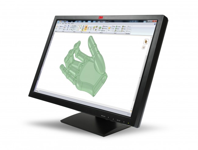
3M currently offers an LCD display that offers 20 touch points (although we got it to register 50), allowing quite a few people to gather around the display and interact simultaneously. We've used the display to showcase several exhibits that were originally designed for our large multitouch tables, and have been very pleased with the screen responsiveness and accurate tracking. The drawback is that the current maximum screen size is 22 inches. Despite the small size, this display could comfortably accomodate 2-3 people, depending on how the display was integrated into the exhibit. These displays also have resilient glass surfaces, making them less susceptible to being scratched or mutilated in a busy environment.

There are a few types of overlay on the market currently that allow you to add multitouch capability to non-touch-enabled displays and surfaces. We've used and liked the PQ Labs G3 overlays, which can be added to any LCD smaller than 65 inches. The overlays support 32 points, which allows several people to use the screen at once. They also offer custom-sized overlays that could allow you to make odd-sized displays multitouch (for example, to create ultrawide LCD signage.) The PQ overlay has a 3mm tempered glass surface, which makes the device more durable and prolongs its lifespan. There are some drawbacks to this technology as well; since it is an infrared optical-based system, its performance can be affected by direct sunlight and strange lighting conditions.
In addition to their excellent performance, these hardware solutions are great because they can be integrated into walls, kiosks, and digital signage with minimal work. We have used both types of hardware for a number of different applications and exhibits with excellent results.
Links We Liked: Clear Multitouch Screens and More
 We were impressed by this video of roomwide touch that lets you share objects between surfaces; we aren't sure that these amazing clear, stretchable touchscreens will be here by 2014, but we hope so; we're looking forward to Firefox 4's implementation of multitouch; we chuckled at the museum that made paintings touchable; we doubted that Windows Phone 7 will ever catch up with Android at this rate; we wanted a lamp that makes any surface into a 3D multitouch display; we were wowed by this homemade spacecraft; we called the Ontario Science Center to report a unicorn sighting; and we felt like we were in Blade Runner c. 2010 at the new Adobe Museum of Digital Media, which just opened today.
Why Your Museum Exhibit Should Be Multitouch
We have a lot of ideas on exhibit design and emerging technologies that we can't wait to share, but before digging into specifics, we wanted to talk a little bit about why we think an open, free multitouch framework is an important tool for museums and educational institutions.

1) It brings a exciting, yet familiar, type of interaction to the museum floor.
Many handheld devices now have multitouch and, as an interactive format on a small scale, it has been wildly successful. Using a direct tactile form of interaction on a technical device rather than a controller or buttons has revolutionized the way that interfaces are designed. It's also been an exciting development for the end user, with devices like the iPhone developing an almost cult following. And thanks to the widespread adoption of multitouch displays on mobile phones, large numbers of people are familiar with these types of interfaces. Open Exhibits allows developers and educators to take advantage of a growing technology to create exhibits that are easy to interact with and exciting to experience.
2) It can transform an individual tool into a social tool.
Open Exhibits core and its modules allow developers to take advantage of multitouch interaction to create larger-scale, multi-user exhibits and extend the technology to create social, educational tools rather than solitary experiences. Since visitors are sharing physical space as well as interactive objects, collaboration and dialogue are encouraged. A key difference between multitouch and traditional interactive design is that multitouch can transform a design element into an actual tactile "object" that can be passed between visitors. This allows multitouch to promote social interactions around and within the exhibit in a way that traditional interactives can't.
3) It allows adopters to shape an emergent technology.
Multitouch interfaces that involve or require multiple users are still relatively new, and designs for such interfaces have a lot of room for expansion and innovation. Open Exhibits will allow museums and educational developers to participate in the important process of debating and defining effective ways to design and build multi-user, multitouch interfaces, and how to best use such interfaces in an educational context.
4) It expands the scope of effective exhibit design.
As we found with our electromagnetic spectrum exhibit, multitouch can allow the effective presentation of complex educational topics in a comprehensive way that would be much more difficult in a traditional exhibit format. Multitouch interfaces like our EM spectrum exhibit allow multi-layered exhibits that offer a dynamic, memorable experience for both the small child who drags a picture back and forth across the screen and the adult who reads every caption about different light wavelengths. Well-designed multitouch exhibits can act as both an attractor to casual passers-by and a truly in-depth look at a specific educational topic, making multitouch exhibits an important possible component of any museum.
Do you have an example of effective multi-user or multitouch design to share? Post your suggestions in the comments; we'd love to see more examples!
