CMME Final Exhibit Component
For the Creating Museum Media for Everyone (CMME) project, the team from the Museum of Science, Boston, aimed to develop a proof-of-concept exhibit component that used multisensory options to display data and whose components could be adapted into a basic toolkit for use by other museums. The development of this exhibit was kicked off with two back-to-back workshops featuring talks by experts in the field and working sessions to explore some possible directions for an accessible digital interactive. This post gives an overview of the final exhibit component and reviews the goals and constraints of the project.
Video tour of the exhibit (closed captions available in the “CC” option along the bottom edge of the video window):
If you are unable to watch the video, scroll down for text and image descriptions of the exhibit.
Goals and constraints:
Although the project included exploring many different technological paths, there were goals for both the overall project as well as the specific exhibit component. The project aimed to create shareable results that would help others in the museum field create more accessible digital interactives that could support data interpretation.
Project goals:
- To further the science museum field’s understanding of ways to research, develop, and evaluate inclusive digital interactives
- To develop a universally designed computer-based multi-sensory interactive that allows visitors to explore [and manipulate]* data
- To develop an open-source software framework [allowing the design of the full interactive to be adapted to fit any institution]*
- To provide an exemplar that will allow other museums to represent data sets as universally accessible scatterplot [or bar]* graphs
*Bracketed portions of the project goals were explored, but are not reflected in the final exhibit component installed on the Museum floor. Code for programming these tasks was developed and will be released in an open source toolkit later this fall for institutions to explore.
Exhibit goals:
- Visitors will understand abstract wind turbine data through multi-sensory interaction and interpretation
- Visitors will improve their data analysis skills to learn about wind turbine technology
- Visitors will view themselves as science learners through their interaction with and manipulation of wind turbine data
Final exhibit component:
We revised an existing component in the Museum of Science’s Catching the Wind exhibition, which allows a broad range of visitors to explore power production data from wind turbines mounted on the Museum roof. Below are text descriptions and pictures of the exhibit that match the content in the walkthrough video above:
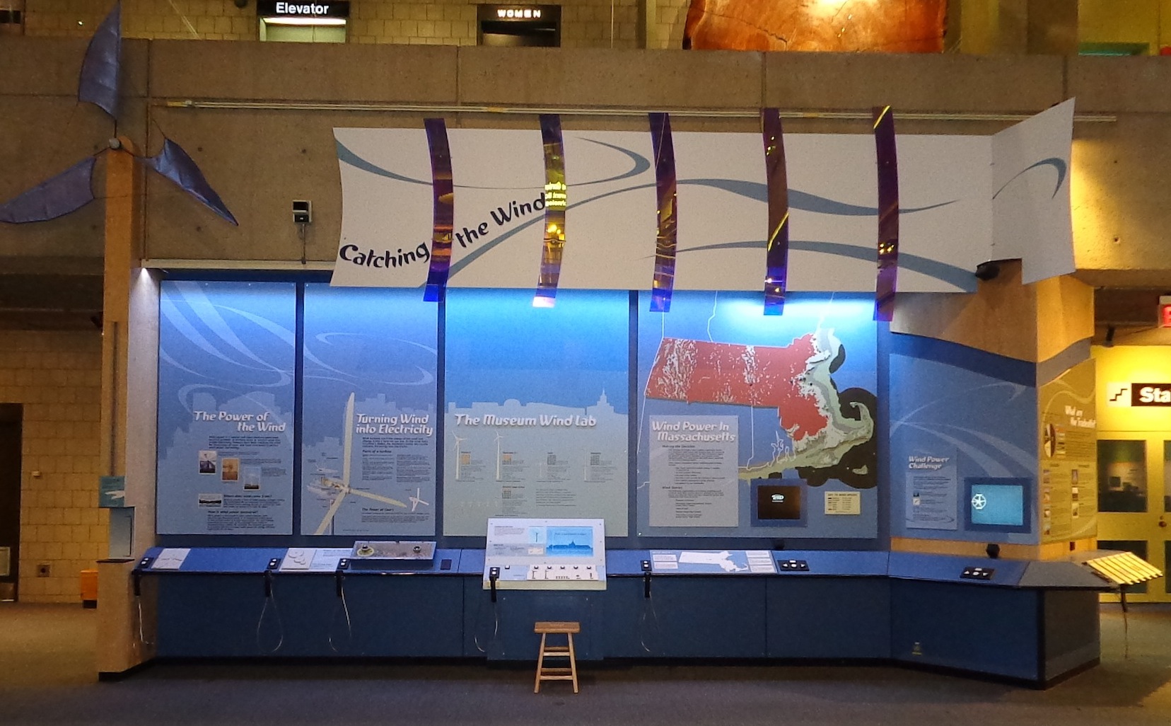
Catching the Wind exhibition
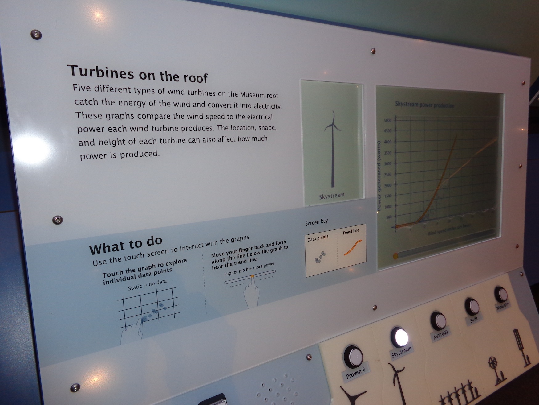
The final exhibit component is part of a larger 25-foot long exhibition extending to the left and right. The component includes an informational label and a touch screen computer activity. The 4-foot wide computer interactive contains auditory and visual graphs showing power production of wind turbines mounted on the Museum’s roof.

CMME exhibit component
There is a large printed label above the computer screen with images and statistics for each turbine type. The lower left side of the exhibit has an audio phone handset with two buttons. The square “Audio Text” button gives a physical description of the exhibit component. The round “Next Audio” button walks a visitor through the printed imagery and text on the labels.
Slanted panel label and touch screen
The slanted panel along the front of the exhibit contains a touch screen, a small introductory label with simplified instructions, a square “More Audio” button which plays a detailed broadcast audio introduction to the graph, and five round buttons with corresponding high-contrast tactile versions of the turbines. A tactile adult person is used for scale next to each turbine.

Buttons and high-contrast tactile scale versions of the wind turbines

Close-up of high-contrast tactile scale versions of the wind turbines
When idle, the large touch screen shows text prompting visitors to “press a round button to begin.” Audio also articulates this prompt when the screen is touched.
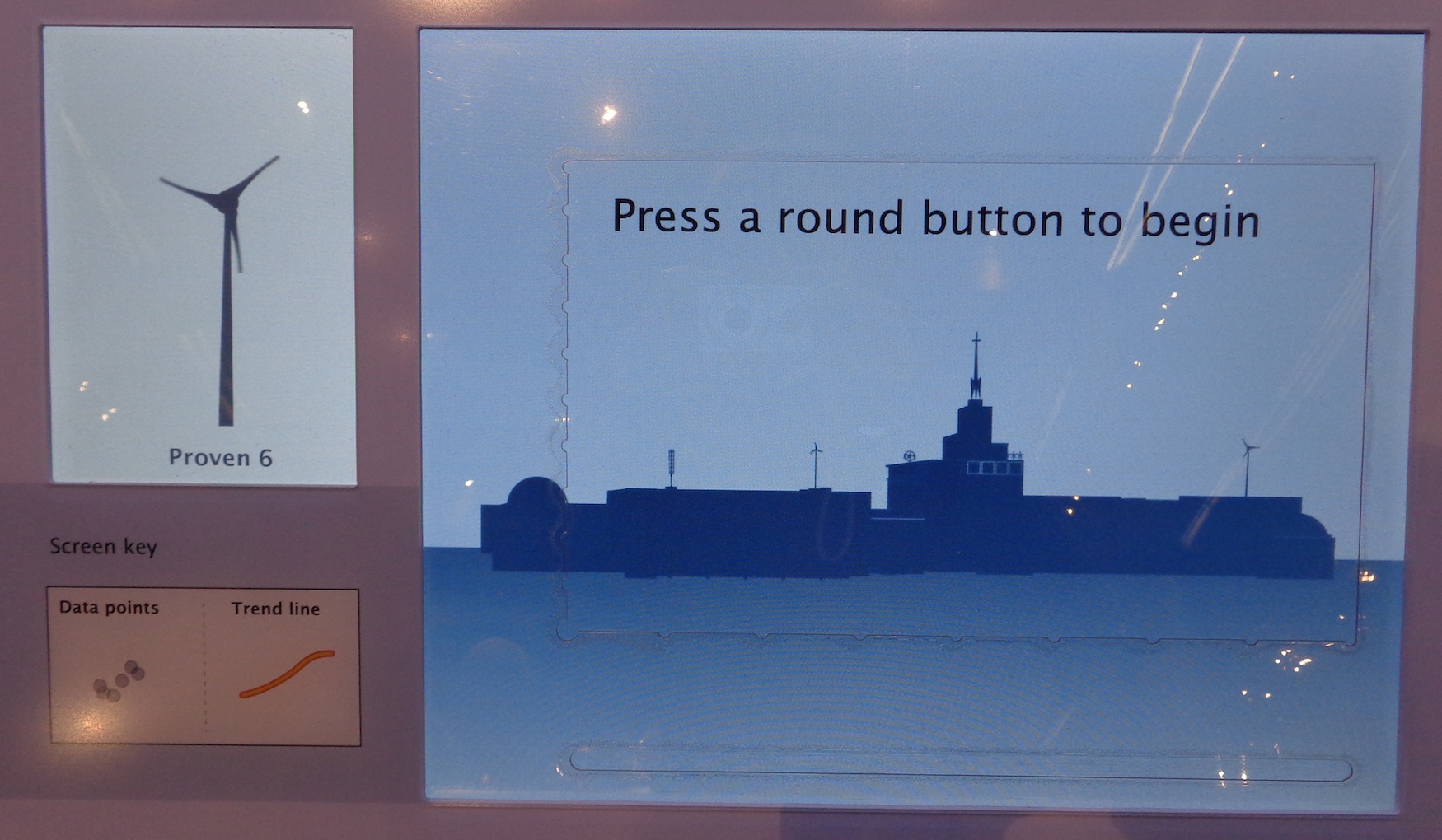
Welcome prompt screen
To begin the activity, a visitor chooses a graph to explore by pressing one of the five round buttons below the computer touch screen. When any one of the buttons is pushed for the first time, a visual and audio introduction to the graph is played. Visitor interaction is limited during the introduction. Once the introduction has concluded, the visitor can then explore the displayed scatterplot graph of power production for that turbine or press another button to view a different graph.
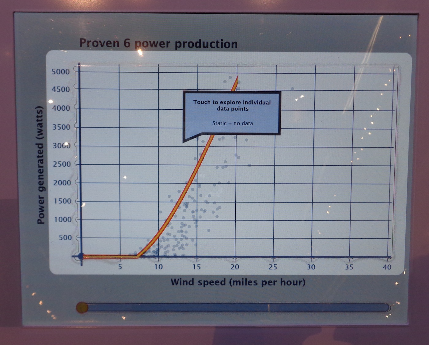
Still from auditory and visual introduction to the graph. Graph area is highlighted. Text within pop-up shown in picture: Touch to explore individual data points, Static = no data
The large rectangular section of exposed computer touch screen has tactile edges with notches that correspond to the axes and grid lines in the scatterplot graphs on the screen. When these are touched, the axes titles and grid line increments are read aloud. Within the graph area, the scatterplot dots are visible and when touched, are articulated by a tone that corresponds with their value. When the visitor touches an area where no data points are present, the visitor hears static. When a visitor holds their finger in one place on the graph, a pop-up text box and audio readout articulate the power produced at that wind speed and how many data points are present in that area of the graph.

Pop-up text box when visitor holds finger on screen within graph area. Text within pop-up shown in the picture: 1361 watts in winds of 16 MPH 6 data points
Along the bottom edge of the main graph area, there is a small, thin line of exposed computer touch screen. When this is touched, the trend line for the data is sonified, corresponding to the location of the visitor’s finger along the x-axis. If the visitor holds their finger in one place along this trend exploration bar, a text box will pop up and audio verbalizes the average power produced at that wind speed.
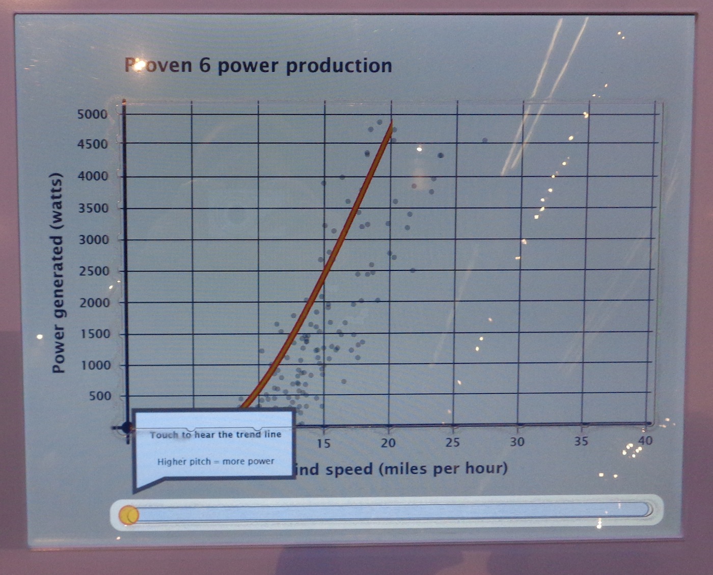
Still from introduction to the graph, highlighting the trend exploration bar below graph area of the screen. Text within pop-up shown in the picture: Touch to hear the trend line, Higher pitch = more power
To the left of the graph screen, there is also an image of the turbine for which the current data is being shown. When this image is touched, audio articulates the image.
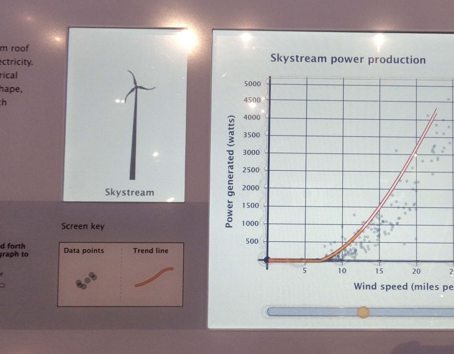
Image of Skystream wind turbine and graph of power production data from that turbine
 team from the Museum of Science, Boston developed an exhibit that uses multisensory options to display data.)
by Emily O'Hara ![]() on September 30, 2014
on September 30, 2014