CMME Exhibit Component: Formative Evaluation Summary
Formative Evaluation Methods:
A total of nine iterations of the Creating Museum Media for Everyone (CMME) exhibit prototype were tested throughout the formative evaluation phase, which occurred from April 2013 to March 2014. Overall, 134 visitors took part in testing the prototypes. This includes 15 recruited people with disabilities and 119 general Museum visitors (who were not asked whether they identified as having a disability). Because people with disabilities were the target audience for this project, they were recruited to come in and test prototypes throughout the exhibit creation process. Their input was crucial for creating a universally designed component. However, even though people with disabilities were the target audience, all Museum of Science exhibits are tested with general Museum visitors to ensure usability, understanding, and interest in exhibits. Testing with people who have a variety of abilities and disabilities ensured that added features that would enhance the accessibility of the exhibit for some visitors did not hinder the experience for others.
The table below outlines the types of disabilities represented in the testing sample:
| Type of Disability |
Number of participants |
| Blind or low vision |
9 |
| Physical |
2 |
| Intellectual |
5 |
| Deaf or hard of hearing |
3 |
Note: Some participants identified as having multiple disabilities. Therefore, totals do not add up to 15.
For each testing session, all visitors were asked to use the component as they normally would if they had walked up to it in the Museum. While they were exploring the interactive, visitors were also asked to use a “think-aloud protocol,” describing what they were thinking about during each step of the interaction. After they were done exploring, the evaluator asked some interview questions and sometimes prompted the visitors to use features that they hadn’t explored on their own. The testing protocol used with on-the-floor Museum visitors versus recruited visitors with disabilities was largely the same, except that the following question was added when testing with recruited visitors with disabilities: “Was there anything you wanted to do when using this exhibit that you were not able to?”
Impacts of formative evaluation on the final design:
Specific parts of the component, its features, and the exhibit content are referenced throughout this post and are explained in depth in the CMME Final Exhibit Component blog post. Briefly, the component presents data about the power generated by five wind turbines on the Museum of Science roof in the form of line and scatterplot graphs. Summarized below are main findings from the formative evaluation, which include a description of visitors’ experiences during testing and how these experiences impacted the final design of the exhibit component.
1. Understanding when there were no data points in an area of the graph
What happened during testing?
When testing the first sonification prototype with three people who are blind, all three people oriented themselves to the component by feeling it with both hands. The screen often froze when multiple fingers touched the screen at once, making it unclear to the visitors whether the prototype was broken or not.
How is this addressed in the final component?
A sound clip of static is now played whenever a visitor is touching an area of the screen that does not have data.
2. Dealing with multi-touch screen capabilities
What happened during testing?
When testing the first sonification prototype with three people who are blind, all three people oriented themselves to the component by feeling it with both hands. The screen often froze when multiple fingers touched the screen at once, making it unclear to the visitors whether the prototype was broken or not.
How is this addressed in the final component?
1) All audio that describes using the touch screen tells visitors to “use one finger” when using the touch screen. 2) The multi-touch option for the screen is now programmed such that if multiple fingers are on the screen at once, it reads data from an average of those points.
3. Accessing the information found on the graph axes
What happened during testing?
When people who are blind were testing an early version of the prototype, in order to get information about the number of watts or number of miles per hour at any specific data point shown on the screen, they would have to remember how many increments they had passed on the axes. Unless they went back and counted the increments on each axis, they were unable to tell which point they were touching.
How is this addressed in the final component?
1) Axes titles as well as graph values are read aloud when a visitor moves their finger along each axis. 2) When a finger is held down in one place on the graph or along the trend scrub bar, data values from that area are verbalized (i.e. “Average power production: X watts at Y miles per hour”).
4. Being introduced to the component features
What happened during testing?
During testing of a close-to-final version of the prototype where visitors could explore all five graphs, an introductory broadcast audio clip played when the first graph button was pushed. This audio clip verbalized information that was included on the exhibit label about what to do at the component. During formative evaluation, this introductory audio could be interrupted if a visitor pushed another button or touched the screen. All visitors who tested in this session interrupted the audio before it finished, often doing so when the audio encouraged them to touch the screen. Many visitors had difficulty knowing what to do and which options were available for exploring the data. The instructions and information given at the end of this audio blurb were areas that many visitors did not use or did not understand during this session.
How is this addressed in the final component?
The introductory audio blurb is now un-interruptible. Visitors must listen to this audio broadcast before being able to interact, something uncharacteristic of exhibit interactives at the Museum of Science. If a visitor touches the screen or pushes a button while the locked audio is broadcasting, a negative sound is given as feedback so visitors know that the exhibit is not broken, but they must wait until they hear “now you can explore on your own” to move on. After implementing this change, visitors understood the instructions and options for exploration more clearly and did not appear to be negatively impacted by the un-interruptible intro audio.
5. Differentiating wind turbines
What happened during testing?
Throughout testing, many visitors were having trouble figuring out what the terms “Aerovironment,” “Windspire,” “Proven,” “Swift,” and “Skystream” meant. These were the wind turbine names that labeled each button and graph. Understanding that these terms were names of different wind turbines was essential for visitors to understand the exhibit content.
How is this addressed in the final component?
We first tried labeling the turbines with a letter (i.e. Wind Turbine A: Proven), but visitors who are blind did not prefer this strategy because the word that differentiates the buttons was not the first one they heard. Instead, we decided to change or modify some turbine names so that visitors can better understand that they are brand names. For instance “Aerovironment” was changed to “AVX1000” and “Proven” was changed to “Proven 6.” This solution allowed for the first word to be unique while making the turbine names less confusing.

Final wind turbine names used in the exhibit: These names are found under the buttons and above the high contrast tactile images of each wind turbine as well as on screen as graph titles.
6. Connecting each graph to its accompanying wind turbine
What happened during testing?
Visitors had some difficulties throughout the formative evaluation understanding that pushing a new button would change the graph shown on the screen and present data from a different wind turbine. For instance, some visitors were able to interpret the data on the screen but weren’t sure what the difference was between different graphs.
How is this addressed in the final component?
1) Each button that corresponds to a wind turbine lights up when visitors choose that button/graph, and 2) an area of the screen is designated for an animation of the related turbine. When a new button is pushed, an animated image of the turbine whose data is shown on the accompanying graph is shown on this part of the screen.
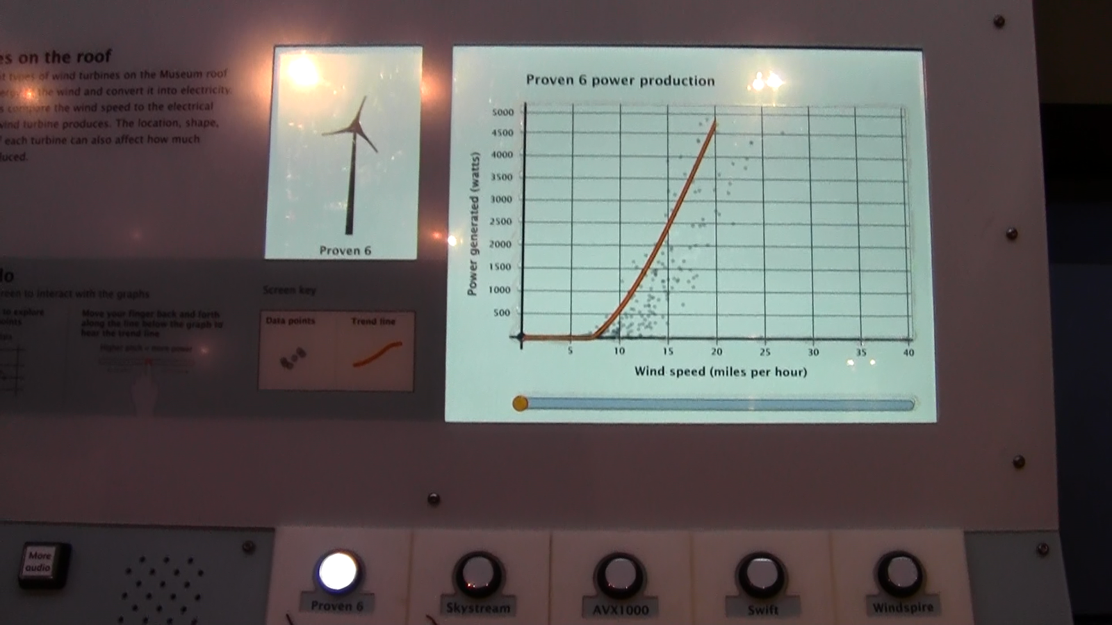
Final exhibit component where the button for Proven 6 is lit up and the screen in the upper left corner shows an animation of Proven 6.
7. Finding the component welcoming
What happened during testing?
A few groups who tested the prototypes throughout the formative evaluation mentioned that they would not be likely to walk up to a screen with graphs on it, either because they didn’t like graphs and didn’t think the activity would be fun, or because they found graphs complex and intimidating. In one of the later testing sessions, one group talked about how much they ended up enjoying the interactive, even though they talked about it initially looking boring and complex when they walked up to it.
How is this addressed in the final component?
A welcome screen was added to the component that shows an animated drawing of the spinning wind turbines mounted on the Museum roof, whose power production data is represented in the graphs. This screen instructs visitors to “press a round button to begin.” If the screen is touched, the instruction “press a round button below the screen to begin” is also read aloud.
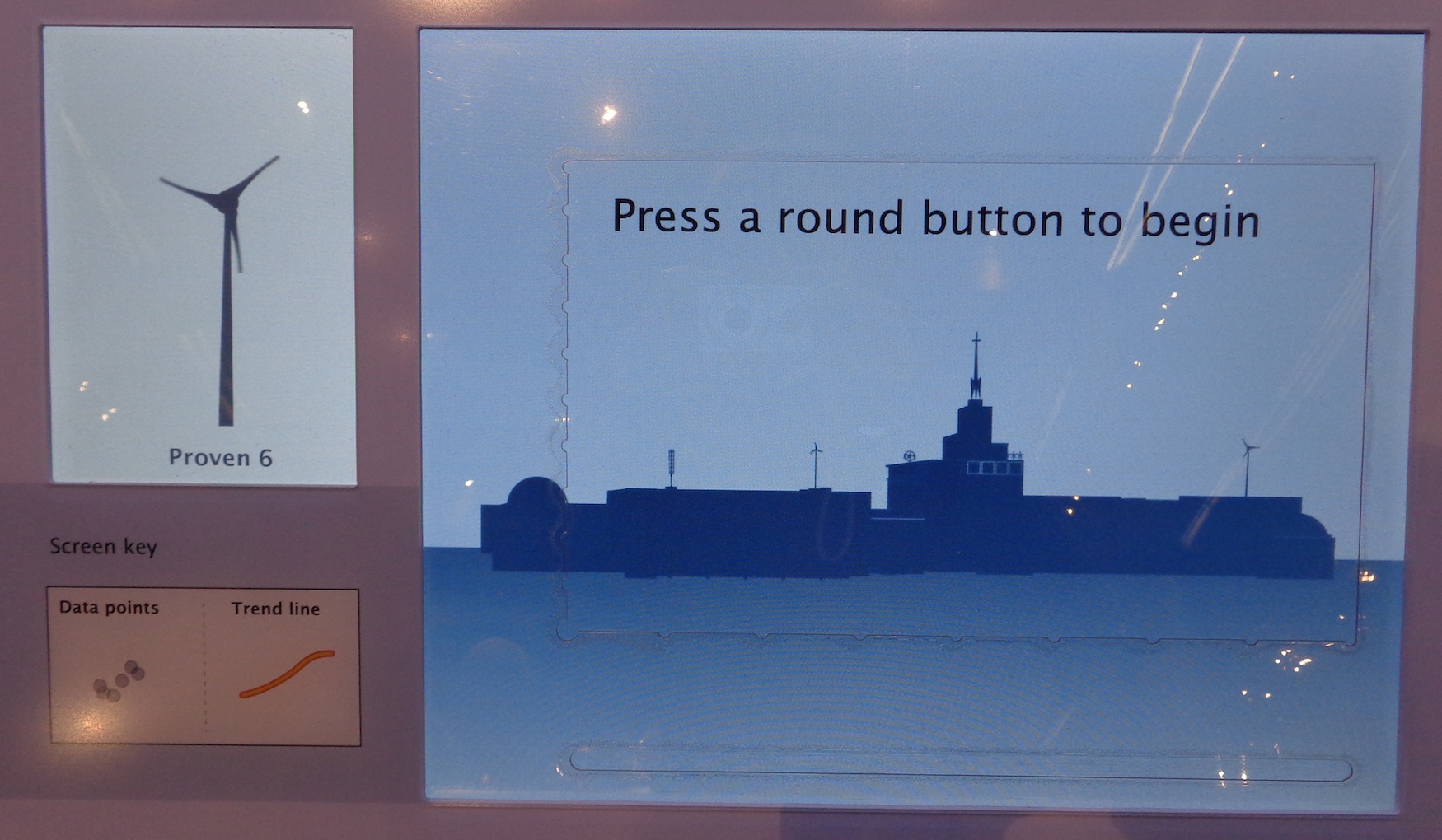
Welcome prompt screen on the final component.
by Stephanie Iacovelli ![]() on October 1, 2014
on October 1, 2014