CMME: Graph Paths Not Taken
Written by Emily O’Hara and Stephanie Iacovelli
For the Museum of Science’s portion of the Creating Museum Media for Everyone project, we wanted to create an accessible interactive that featured graphed data. The final exhibit component contains five scatter plot graphs, each with a calculated trend line. In addition to the graph options available in the final exhibit, the development team wanted to find a way for visitors to compare the data between graphs. We explored layering the graphs and comparing data through the use of a bar graph. Although neither of these solutions worked for our exhibit, we wanted to share the paths we tried, as they may be more applicable for others.
Layered graphs
For this exhibit, we were revising an existing element in the Museum’s Catching the Wind exhibition. The original graph interactive enabled visitors to view the power production graphs of the same five turbines we used in the final version, but it also allowed visitors to compare the turbines by layering two, three, four, or five of the data sets on one graph.

Picture of the original exhibit computer screen, showing how data for two of the turbines could be layered on the same graph. Scatter plot points for one of the turbines are shown in red and those for the other are shown in green.
When we began adding sonified audio tones to the data, in order to make the graphs accessible to visitors with low or no vision, we wanted to maintain the option of comparing graphs. We first attempted to simply layer two tones on top of one another and have them play simultaneously. This was not successful and users did not always realize there were even two different sounds present. Next, we tested playing one graph’s sonified trend line followed by the second, then playing both of them together. When we tested this with visitors who are blind, this method helped with comprehension and comparison, but ultimately we did not find the benefits of playing the layered audio outweighed the risk of confusion.
Bar graph
We also developed a bar graph for display in this exhibit so that visitors could more easily compare the power production of each wind turbine on the same graph.
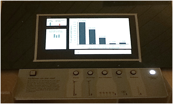
Picture of the bar graph prototype. For this version of the exhibit, visitors could still view each of the five wind turbine scatter plot graphs and then the bar graph was added as a sixth option. This version also had an area of the touch screen which contained dynamic instructions which changed to correspond with the type of graph on display.
While this type of graph allowed visitors to compare between wind turbines, we found it also required another layer of graph orientation. In addition to the detailed introduction visitors needed for the scatter plot graph, they needed another set of instructions for the bar graph. Switching between scatter plot and bar graphs also created additional confusion for users who are blind. We were using tactile grid lines to help orient visitors on the scatter plot graph and then, on the bar graph, the vertical grid lines no longer had meaning, but were still present on the graph. Overall, we decided the value of the bar graph was not worth the confusion it caused in our particular exhibit.
In our final exhibit, each graph only shows the data from a single wind turbine’s power production. To help visitors compare the graphs with one another, when a graph is first selected, the graph title is read and then the sonified audio trend line for that data is played. This enables a visitor to press each button of the graphs they want to compare and view or listen to them in quick succession. The axes values are also maintained between graphs to allow for this comparison.
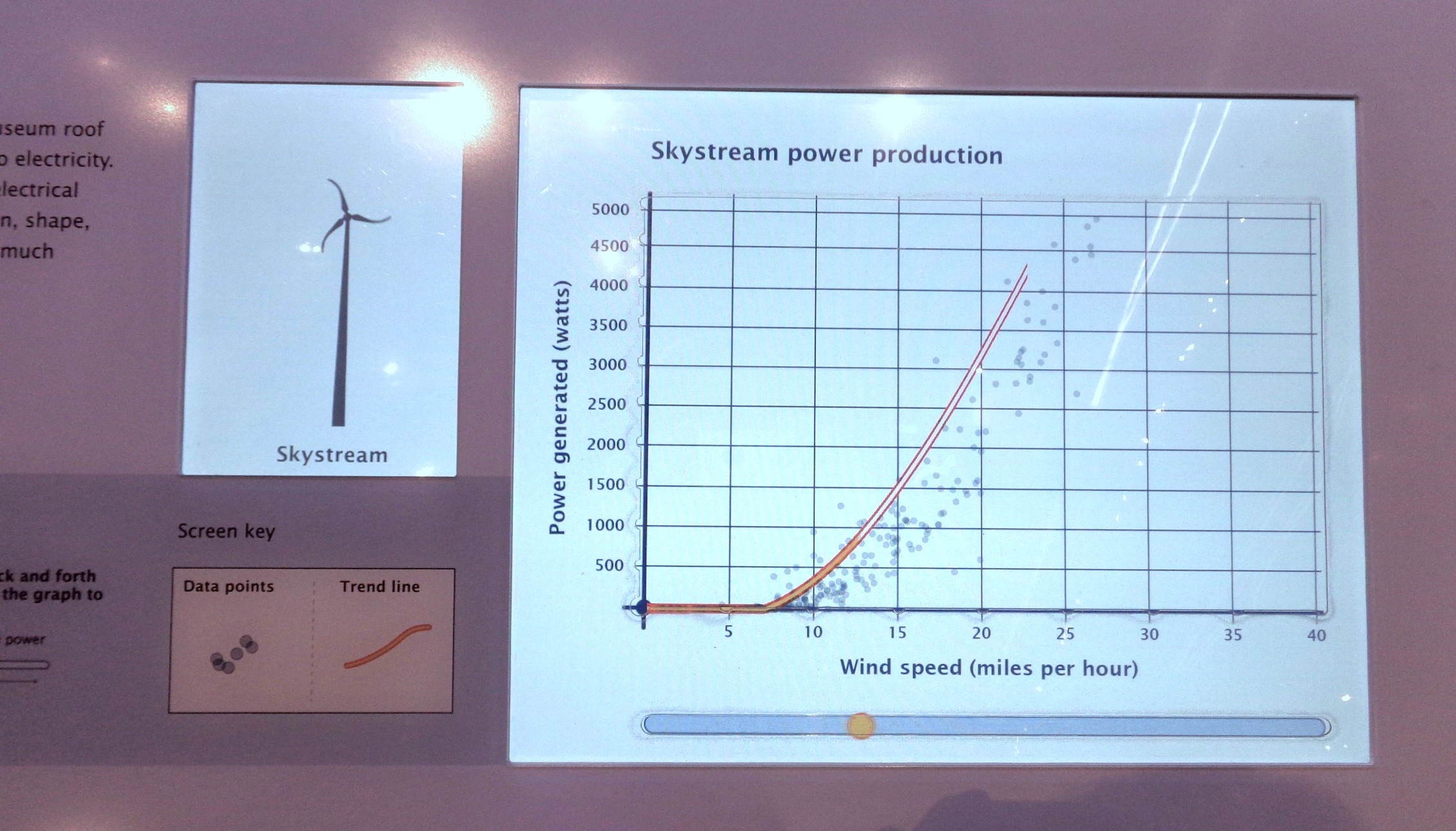
Picture of the final exhibit screen displaying the Skystream wind turbine’s power production graph. Scatter plot dots represent each data point that was collected and the bright orange line drawn through the middle of the data points represents the trend for these data. A horizontal bar runs below the length of the graph area and contains a circle which can be moved back and forth to play back the audio sonification of the trend line.
How would you design an accessible exhibit to compare data sets? What other types of graphs would be useful for this comparison?
by Emily O'Hara ![]() on December 31, 2014
on December 31, 2014