CMME: Tactile Paths not Taken
Written by Malorie Landgreen and Ben Jones
The Creating Museum Media for Everyone (CMME) team at the Museum of Science, Boston (MOS) explored many avenues to address our goal of making accessible digital interactive as useful as possible.
While reading through this blog, you will see examples of the work our team developed while brainstorming this interactive component, and the reasons some of these attempts were not chosen for the final proof-of-concept component. This post will review the tactile techniques we explored that did not end up in the final exhibit.
If you have not yet read our prior blog posts, the CMME Final Exhibit Component shows the final proof-of-concept exhibit component that the team installed and the Formative Evaluation Summary reviews how we got there.
Now, let’s dive into what didn’t work.
Capacitive Sensing Buttons
What is this?
3D-printed stainless steel buttons acting as touch sensors (printed at Shapeways)
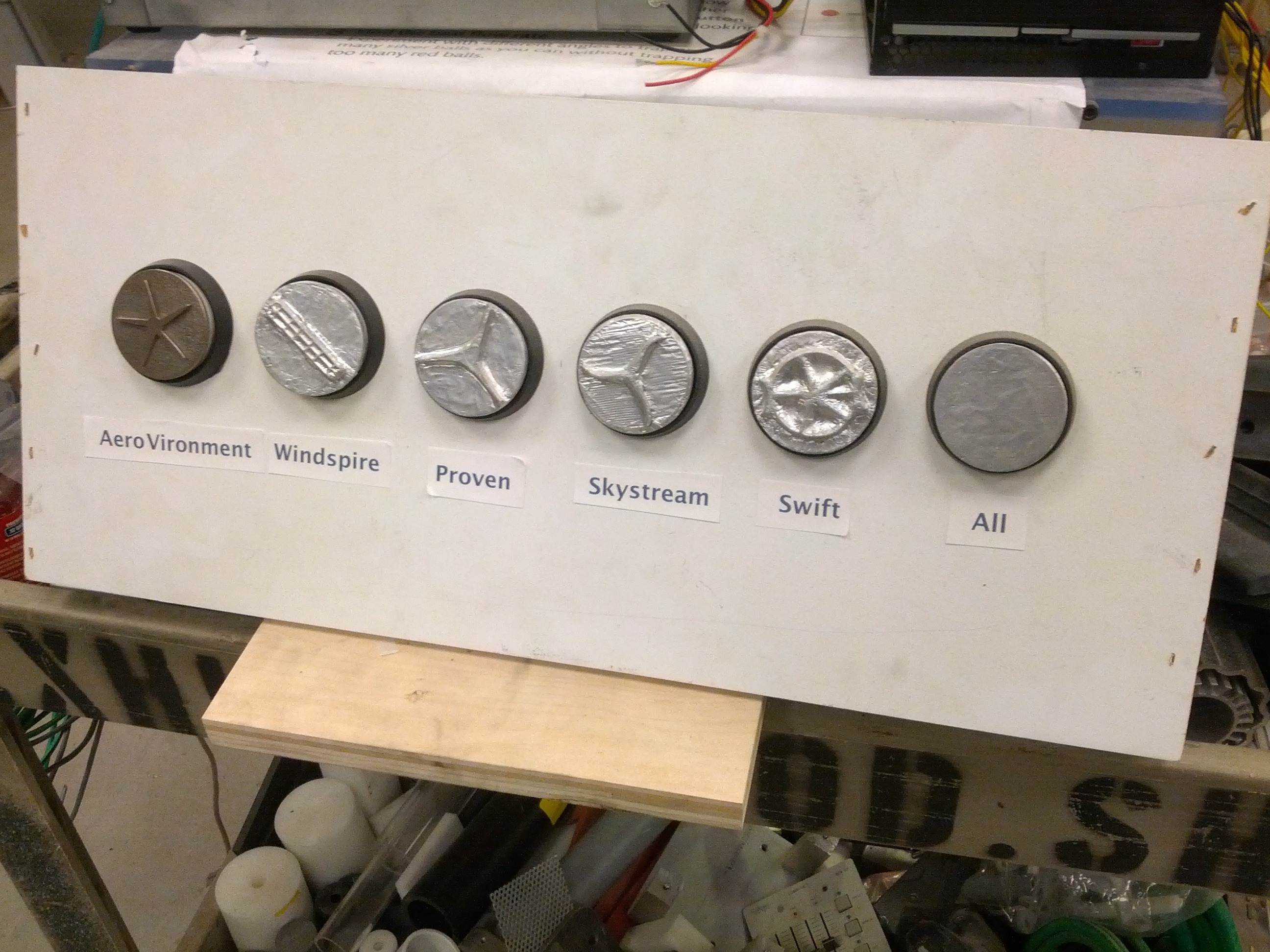 Picture of an array of six capacitive sensing buttons in an early prototype.
The far left button was 3D-printed stainless steel and the other five buttons were 3D-printed in plastic and wrapped with aluminum foil to make them conductive.
Why we tried it
The team wanted a physical representation of the turbines, and by combining the 3D prints of the turbines with a buttons press, served to identify each button directly. By touching the metal button, it triggered an audio label that read the name of the turbine. Physically pressing the button selected the graph our visitors wanted to explore.
How it was made
The buttons were printed in stainless steel because it was the most affordable conductive material; however, bronze and brass were also available. The 3D buttons were designed to fit into an off-the-shelf arcade button. These buttons were altered by removing the small light bulb inside, and replacing it with a piece of metal in the socket.
A spring made the electrical connection between the moving portion of the button and the light bulb socket. A wire ran from the light bulb socket to an Arduino to do the capacitive sensing. Using the Arduino Leonardo to send keystrokes to the computer (one keystroke for the audio when a capacitive sensor detected a touch, and another when the button was pressed).
When someone touched the button there would be a spike in capacitance. Initially, this just sent a threshold for the capacitance values to detect a touch, but a better method created a moving average of all of the capacitive sensors. If the value detected was above the average by a certain amount, then it was a touch event.
 Picture of the deconstructed and altered button with a small piece of metal in the light bulb socket
Why didn’t it work?
We moved away from capacitive sensing buttons because it caused confusion as to how to interact with this component. When visitors touched the button, they triggered audio label readout and expected something more to happen. They did not realize they needed to press the button down to select the turbine graph.
We did not simply eliminate the capacitive functionality of the 3D buttons. The 2-inch round buttons were also too small to allow for to-scale models of the turbines, preventing an accurate understanding of the size differences between each turbine.
What was kept
In the final proof-of-concept exhibit component, we kept the off-the-shelf arcade buttons to be used as regular buttons and 3D-printed models of the turbines were installed below each button. We added a grooved edge for easy navigation between the button and the 3D print, so our visitors can easily associate each button with its 3D-printed turbine.
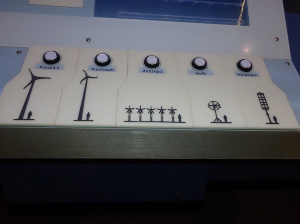 Picture of the final array of five buttons, each with a to-scale, high contrast, 3D-printed turbine below.
Touch Screen Grid Overlay
What is this?
A clear acrylic die-cut grid, lined up perfectly with the graph grid lines on the touch screen behind.
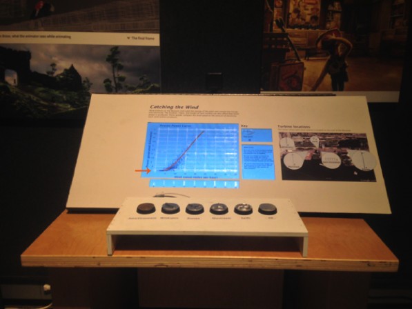 Picture of an early prototype of the exhibit component with an arrow pointing at the touch screen where the clear acrylic grid was attached.
Why we tried it
The team discussed the need for a grid overlay that would allow our visitors who are blind or have low vision to be able to identify the lines of the graph for a better sense of where each data point is located. We wanted it to be a clear acrylic overlay so that it would not detract from visual elements of the graph.
How it was made
A graphic was created to the same scale as the graphic for the touch screen graph. It was then cut out in-house using a vinyl cutter. The overlay was attached to a full sheet of clear acrylic with a clear-drying adhesive. The layered acrylic sheets were tested to make sure the underlying touch screen could still sense touch. This solution was not implemented in the final exhibit component, so it was never produced in a more durable way.
Why didn’t it work?
This solution did not work because it ended up being more of a distraction to our visitors than an aid to understand the graph more thoroughly. At the time of this testing, the team was designing the interaction to also allow for a bar graph to compare all of the turbines, but the static overlay caused confusion when the scatterplot graph changed to a bar graph. With further testing, the team discovered that there was a simple solution that didn’t cause as much permanent visual or tactile clutter; audio was added to articulate where on the graph a visitor was touching.
What was kept
A simplified version of the clear acrylic overlay was kept for the final component, in which just the graph axes are raised, with notches along each axis where the grid lines are located. Audio supplements this interaction by articulating the axes titles and gridline increments when they are touched. When a visitor holds their finger in one place on the graph, audio also reads out their location and details about the nearby data.
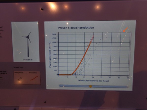 Picture of the graph screen in the final exhibit component with an arrow pointing at the top right corner of the graph where the edge of the clear acrylic overlay is faintly visible.
Sonification Strip
What is this?
A separate horizontal bar below the graph that allowed visitors to run their finger across it to hear the trend line of each graph.
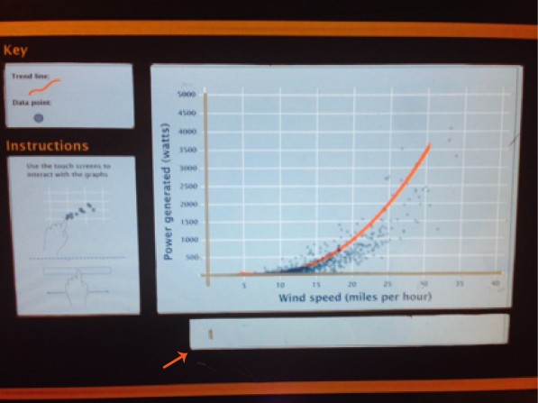 Picture of an early prototype in which the sonification strip and the main graph area were demarcated by two separate cutouts in the graphic that covered the touch screen. An arrow is pointing to the sonification strip.
Why we tried it
We wanted our visitors to hear the trend line quickly and easily, as many times as they would like for each turbine. Hearing the trend line play one time after the button press, and then exploring the data points, didn’t allow all of our visitors to fully understand the power production trend of each turbine. The detached strip would keep the difference in functionality separate from the scatterplot graph above, but still allow for visitors to hear the trend as often as they desired.
How it was made
There was a cutout portion of the graphic that was laid on top of the touch screen. The cutout was a 1-inch tall strip that ran along the full length of the graph, about 1/4 inch below the bottom of the graph.
Why didn’t it work?
The separation between the graph and the sonification strip kept our visitors from either finding it or understanding that it correlated to the trend line on the graph.
What was kept
The team decided to keep the basic concept of the sonification strip, because the ability to hear the trend line multiple times was successful, but integrated it into the tactile acrylic overlay. This allowed for the relationship of the strip and the graph to be more integrated.
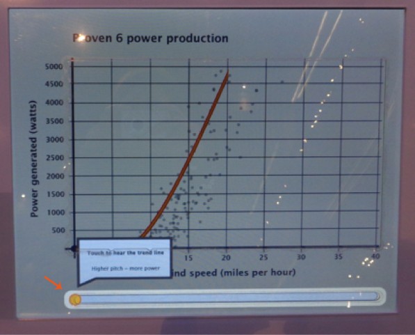 Picture of the final exhibit component touch screen with the sonification strip highlighted during the introduction to the graph. There is an arrow pointing to the sonification strip and the text on the screen states: Touch to hear the trend line; Higher pitch = more power.
These three examples of unused tactile concepts led to a stronger final design for our component, but they may be more applicable in different situations. Have you tried other tactile options for visitors? Leave a comment below with other resources that have worked for you.
 team developed an exhibit that uses multisensory options to display data. These are some tactile methods the team explored.)
by Emily O'Hara ![]() on October 15, 2014
on October 15, 2014