Blog
Touchless Design Open-Source Software Now Available
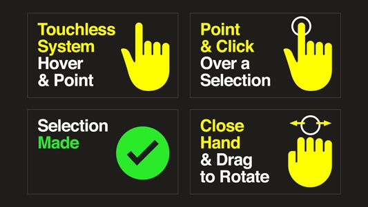
Ideum is pleased to announce that Touchless Design SDK Version 1.0 is now available on GitHub. Touchless Design software allows developers and museums to create touchless interactive exhibits. The software is open-source and released under the GNU LGPL version 3.0 license. Please see the full software license for more details. The software uses a mouse-emulation layer coupled with a color-coded system of icons.
You can learn more about our work on the Touchless.Design website.
New Open Source Initiative: Touchless Design
While Open Exhibits officially wrapped up its work two years ago, we’d like to point you to a new open-source initiative, Touchless Design. This new initiative focuses on zero-touch technology and how it can be used in public spaces such as museums, you can check out the press release, released last week.
For this unique project, we are collaborating with the National Gallery of Art with whom we will be conducting testing and building a proof-of-concept kiosk that will be installed early this Fall. In addition, we’ve been fortunate enough to have received funding from Intel as part of their Pandemic Response Technology Initiative.
In the coming weeks, we will be testing our early prototypes, publishing our findings, and continuing to refine and develop the hardware and software. Along with the National Gallery of Art, we are working with other institutions on new proof-of-concept exhibits. You can follow our development or join us, just visit the Touchless Design website (https://touchless.design) or follow Ideum on its social media channels.
Open Exhibits: Wrapping Up, Moving Forward
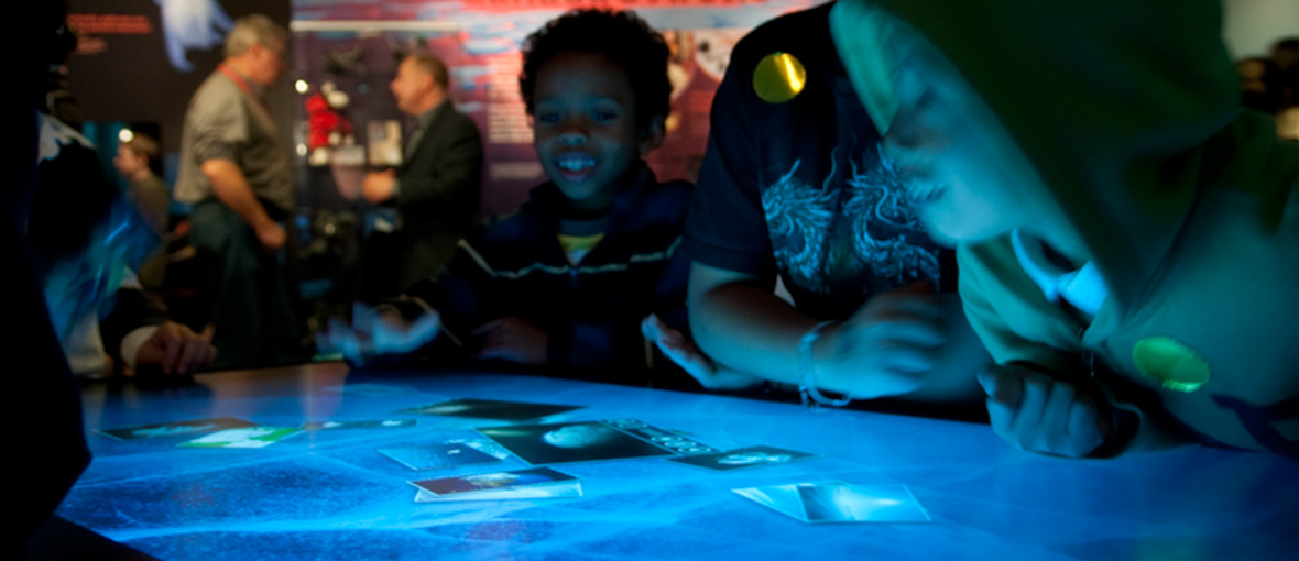
Eight years ago, Ideum and an extraordinary group of creative partners received a grant from the National Science Foundation to develop and disseminate Open Exhibits, “a free suite of original, multitouch-enabled, open source exhibit software.” The idea was to develop software that museums large and small could use and modify, and to develop a community of practice to share emerging approaches in digital exhibit design. After eight years of innovation and sharing, it is time to announce that the forum is closing to new input. The exhibit-development landscape has expanded and evolved in numerous ways in recent years, and many free or inexpensive exhibit design and development tools are now available that were unimaginable a decade ago. However, as the Open Exhibits application is still in circulation, we will continue to make the software freely available as long as it is useful to the community.
The NSF funding that initially supported Open Exhibits ended 4 years ago. Since then, we have been very fortunate to keep the forum operating, in part with funding by the Institute of Museum and Library Services (IMLS MG-30-0037-1) with another collaborative project called Omeka Everywhere. Ideum was pleased to match the funds we received from IMLS on a dollar-for-dollar basis.
This project involved the development of a multitouch table and mobile application utilizing Open Exhibits software and drawing from Omeka’s digital collection content management system. The project team included the Roy Rosenzweig Center for History and New Media at George Mason University, and The University of Connecticut’s Digital Media and Design Department.
We are proud of the work that we accomplished over the project’s eight year run. During that period, the field experienced massive changes in how digital exhibits were designed, developed, and evaluated. Over the history of Open Exhibits, we had thousands of downloads of our software and gathered for wider dissemination hundreds of papers on interactive technology, exhibit design, usability, and the future of museums. In addition, we also developed experimental applications that were well ahead of their time, including Heist, a way to connect mobile apps and touch tables. (In fact, that project paved the way for our later work with Omeka.)
Our website also hosted and promoted the NSF-sponsored Creating Museum Media for Everyone project with Museum of Science, the WGBH National Center for Accessible Media, Audience Viewpoints, and Ideum. In addition, our work with Open Exhibits led directly to the NSF sponsored HCI+ISE Human Computer Interaction and Informal Science Education conference organized with Independent Exhibitions.
As we mentioned, we will continue to make the Open Exhibits software available, and our partners at Omeka are still going strong. Although the forum is closing, Ideum will certainly continue to develop new kinds of exhibits and to work with an ever-increasing range of museums, informal education professionals, and community organizations.
We thank everyone who participated in the project—and we look forward to the next chapter in making exhibits more compelling, social, and impactful than ever before.
Pairing Open Exhibits software with Omeka platform creates a mobile multitouch experience
Over the last two years, Ideum has been working with the Omeka team to produce Omeka Everywhere, a multitouch table and mobile application utilizing Open Exhibits software and drawing from Omeka’s digital collection content management system.
Funded by the Institute of Museum and Library Services (IMLS MG-30-0037-1), the project team includes the Roy Rosenzweig Center for History and New Media at George Mason University, The University of Connecticut’s Digital Media and Design Department, and Ideum.
The Omeka Everywhere app uses the Omeka API to connect to online collections. Institutions can modify the Omeka Everywhere source code and easily create mobile apps that connect to their online collections.
App users can interact with collection items and sorting by keywords, zooming in on images, and learning more from information displayed on the flipside of each image. Users can also save favorites from the collection as they browse.
Omeka Everywhere is for museums, historical societies, special collections libraries, and anyone who is interested in extending their Omeka online collection to mobile users. In addition, the mobile application can be paired with a multitouch table or touch wall experience. This unique feature allows in-gallery visitors to view and seamlessly share collection items between devices.
The mobile application is compatible with both iPhone and Android devices. The Omeka Everywhere mobile application and the touch screen Windows application are free and open source. The Android version of the Omeka Everywhere app can be downloaded from the Google Play Store. The open-source application is available on [GitHub](https://github.com/ideum/omeka-everywhere).
We’ve previously posted about the Omeka Everywhere project and the challenge of creating touch table to mobile applications for museum visitors. You can read that post here, or here).
This project was made possible in part by the Institute of Museum and Library Services [award number MG-30-0037-1].
The Hard Problem of Connecting Mobile Apps to Touch Tables
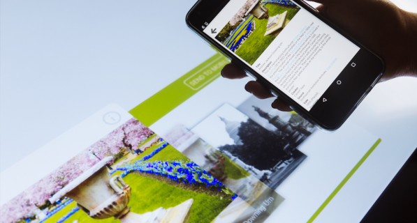
The role of mobile applications in the museum field has been a matter of discussion since the debut of the iPhone a decade ago. Since then, many museums have developed mobile apps, explored way finding, and experimented with other uses for these ubiquitous devices. Five years ago, we developed an experimental application called Heist which connected mobile devices to digital collections found on touch tables using a captive portal and HTML5. Ahead of its time, Heist was difficult to scale and implement broadly, but we hung on to the idea, wrote another grant (with our partners) and have since developed a new Heist-like system called The Omeka Everywhere Collections Viewer.
Omeka Everywhere is an IMLS-funded project that has brought together Open Exhibits and Omeka to make collections more accessible to the public in a variety of settings. The Omeka Everywhere project is a collaboration between the Roy Rosenweig Center for History and New Media at George Mason University, Ideum, and Connecticut’s Digital Media & Design Department. The software we’ve developed allows museum visitors to pair their mobile devices with a collections viewer application optimized for a multitouch table or a touch wall. Visitors can then favorite collection items and share them on their preferred social media platforms.
As the video demonstrates, we used a mobile app and simple numeric code in the table software to pair devices with stations on the touch table. It is a simple and highly reliable way to connect the applications. The advantage of a full mobile application (as opposed to the HTML5 captive portal page used with Heist) is that the mobile application will travel with visitors after their museum experience ends. The challenge may be getting the museum goers to take the time to download the application in the first place. A possible solution would be to make it easier to download the application at the museum itself, through a captive portal. That may increase adoption. We will soon see how museums use this software and how many visitors opt to participate.
At the moment, there isn’t a simple way to connect to people’s personal devices in museums. Visitors bring their iOS and Android phones with different hardware specs and various OS versions. Sharing between devices in a public setting isn’t seamless. Along with hardware and software fragmentation, general concerns about privacy and security are real, so for the foreseeable future there will be imperfect methods for these types of experiences. Still, for those visitors who do participate, our usability testing strongly suggests that they will have an enhanced experience at the museum and they will take the collection (and their favorites) with them as they leave to share, study, and re-experience on their own terms.
The Omeka Collections Viewer and its mobile application companion will be available later this summer to museums, cultural organizations, and others via Open Exhibits and Omeka. The applications will be free and open. Attendees of this year’s American Library Association Annual Conference and Exhibition in Chicago will have a chance to see the Omeka Collections Viewer in person at Ideum’s exhibition booth 5237.
This project was made possible in part by the Institute of Museum and Library Services [award number MG-30-0037-1].

Universal Design Guidelines for Computer Interactives
At the Museum of Science, Boston, we have been reviewing our software development and design process and we have compiled our findings from the last decade into a list of guidelines to consider. This list is an updated version of the table found in Universal Design of Computer Interactives for Museum Exhibitions (Reich, 2006). Although these are not strict rules, we are hoping they help provide a foundation on which to build during development of a universally designed computer interactive.
This list is organized by development area and each guideline is followed by a code, indicating which audiences benefit the most from these considerations. The key for these codes can be found at the bottom of this post.
Overall exhibition
- Minimize background noise (D, HH, DYS)
- Minimize visual noise (DYS, ADD, LV)
- Stools for seating (LV, YC, OA, LM)
- Consistency in interaction design throughout exhibition (B, LV, ID, LD, NCU)
Content development
- Multisensory activities for framing (ALL)
- Use of the clearest, simplest text that is free of jargon (ER, ID, LD, ESL)
- Screen text that makes sense when heard and not viewed (B, LV, ID, ER, ESL)
- A short description of the activity’s goals presented through images, audio, and text (ADD, NCU)
- Clear, simple directions that provide a literal and precise indication of what to do and the exact order for doing it (B, LV, ID, LD, NCU)
- Make as many options as possible visible to maximize discoverability (ALL)
- Minimize number of actions required to accomplish a given task (ADD, ASD, ID, NCU)
Hardware
- A tactile or gestural interface, such as buttons, for navigating choices and making selections (B, LV, LM)
- Care should be taken when combining multiple modes of interaction (B, LV, D, CD)
- Tactile elements that do not require a lot of strength or dexterity (LM, YC)
- Input mechanisms are within reach for all visitors (ideally limited to a 10” depth at a 33” height) (WC, EXH, YC, LM)
- Monitors, overlays, and lighting are designed to reduce screen glare (SV, LV, EXH)
- Usable controls within reach of the edge of the table (LM, WC, LV, YC)
- 27-29 inches of clearance beneath the kiosk, with a depth of at least 19 inches (WC)
Software development
- Connect to existing standards or everyday uses of technology (FCU)
- Minimized use of flickering and quick-moving images or lights (SZ, ASD)
- User control over pace of feedback (HH, ASD, ID, B, LV)
- Control over the pace of interaction, including when a computer “times-out” (D, B, LV, LM, DYS, LD)
- A limited number of choices presented at one time (5-7) (B, LV, ID, ADD)
- Minimized screen scrolling (LV, ID, NCU)
- Limit unintentional input by providing tolerance for error (B, LV, LM, NCU)
- Provide easy methods to recover in the event errors are made (B, NCU, LD)
- Adjustments of a control should produce noticeable feedback (ALL)
- Ensure feedback is as close to real-time as possible (B, LV, CD, D, NCU)
- Ensure dynamic elements indicate current status (e.g., active vs. inactive, selected vs. unselected) (ALL)
Audio/Video
- Auditory feedback for what is happening on the screen (ALL)
- Audio descriptions for videos, images, and other visual-based information (B, LV, ID)
- Screen text that is read aloud (B, LV, ID, LD, ESL, ER)
- Open captions for videos and non-text based audio (D, HH, OA)
- User control over volume (HH, ASD)
Graphics
- Clearly labeled audio/video components that are also presented visually, through open captions or images (D, HH, OA)
- Text with a large font, clear typeface, capital and lower case letters and ample space between lettering and text lines (test on final screen or device to ensure legibility) (LV, OA, DYS, EXH)
- High contrast (at least 70%) images and text (LV, OA, CB)
- Alternatives to color-coded cues (LV, OA, CB)
- A non-text visual indication of what to do and the activity’s content (ER, LD, DYS, ESL)
- A clear, consistent and repetitive layout for presenting information (B, LV, LD, NCU)
- Clear mapping between the buttons and screen images (SV)
- Screen design should be intuitive and not to draw attention away from the learning goals (ALL)
Key for audience members who benefit:
ADD – visitors who have Attention Deficit Disorder
ALL – all visitors
ASD – visitors affected by Autism Spectrum Disorder
B – visitors who are blind
CB – visitors who are color blind
D – visitors who are d/Deaf
DYS – visitors with dyslexia
ER – visitors who are early readers or are learning to read
ESL – visitors whose first language is not English (including American Sign language users)
EXH – visitors at extreme heights (low and high)
FCU – visitors who are frequent computer users
HH – visitors who are hard of hearing
ID – visitors with intellectual disabilities
LD – visitors with learning disabilities
LM – visitors with limited mobility
LV – visitors with low vision
NCU – visitors who are new or infrequent computer users
OA – visitors who are older adults
SV – visitors who are sighted
SZ – visitors who are subject to seizures
WC – visitors who use wheelchairs
YC – visitors who are young children
New Accessibility Feature Enhances Open Exhibits Experience
Video tour of enhanced Solar System Exhibit
Enhanced Solar System Exhibit
Ideum (the lead organization of Open Exhibits) has made significant progress in multitouch accessibility in the process of developing three prototypes for the Creating Museum Media for Everyone (CMME) National Science Foundation-funded project. The third prototype, a new version of our Open Exhibits Solar System Exhibit, incorporates improvements based on usability test results and suggestions from the Museum of Science Boston, National Center for Interactive Learning, WBGH, and advisor Sina Bahram. The major new feature in the current version is an accessibility layer designed for visually impaired users on large touch screen devices. This new CMME software will be released February 6, 2015.
Enhanced Solar System Exhibit with accessibility layer
Accessibility Layer
The main component of the accessibility layer is the information menu browser. To activate the menu browser, a user holds down three fingers for two seconds. This can be edited to incorporate most of the hundreds of gestures used in the Open Exhibit framework. During this hold, the user receives audio feedback letting them know the accessibility layer is activating. Once the menu is active, the user can swipe left or right to access different choices on the menu, in this case, the different planets in the solar system. The text that normally appears on the screen when an item is chosen from the visual menu is automatically narrated aloud. Using a simple set of gestures, the user can control the menu and the content to be read.
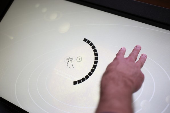
User enables accessibility layer
Future Steps
In the current version, the accessibility layer is intended for one user, and that one user controls what content is active for the entire screen. We are currently working on a multi-user version that will incorporate multiple “spheres of influence” to allow users to control a range of space from a small area. Using these “spheres of influence,” multiple visually impaired and/or sighted users can interact with the exhibit simultaneously. The multi-user version’s audio will be multidirectional, that is, can be split so that users on different sides of the table can listen to different parts of the content at the same time. Our next step is to develop visual elements that will play along with the audio narration for those who have limited sight or hearing impairment, or are learning the English language.
CMME Exhibit Resource Overview
We have finished posting about the Museum of Science's portion of the Creating Museum Media for Everyone (CMME) project. In case you missed any of the posts, you can find direct links to each of them below.
Background: These posts include resources and thinking that jumpstarted our exhibit development process.
- CMME Workshop Part 1
- CMME Workshop Part 2
- Use of Workshops for Promoting Universal Design
- Museum Accessibility Resources
- Additional Museum Accessibility Resources
- 2012 Workshop Themes
- Applying Universal Design
- Haptic Possibilities in Exhibits
- Persona Development and Uses
Final Exhibit Component: These posts detail the final exhibit, which is a part of the Catching the Wind exhibition, at the Museum of Science.
Exhibit Development Toolkit: These posts include specifications for the software programming, design, and text we used in the final exhibit. Feel free to repurpose any of the resources in these posts for your own exhibit development.
Paths Not Taken: These posts dive deeper into multi-sensory techniques we tried that did not work for our exhibit, but may be useful in other applications.
